Why packaging is important
5min read
19/12/2014


For bees, the most attractive flowers are those with the brightest colours.
In this respect we are a bit like bees: we are attracted to all colours and shapes that stand out.
It becomes easy to imagine how our attraction to eye-catching packaging often exceeds our rational judgement.
It is no secret: product packaging is designed to make us want the product inside, it is designed to make us feel like children in a sweet shop.
Product marketing specialists often consult psychologists to determine what can move products from the shelves to the hands of consumers.
The ultimate goal is to get us to shove the goods into the trolley. Colours, lettering, words, shapes are all part of a persuasion strategy, aimed at making us believe that by buying that product we will improve our lives.
These are psychological tricks, to bring out the child in us, to hit the amygdala, the most ancestral part of our brain.
If packaging succeeds in making us feel: excited, eager, protected, safe, and above all if it succeeds in making us buy the products inside, then the men and women of marketing can rest easy, they have done their job well.
One occasionally wonders about the reason for certain unnecessary packaging of products.
Is it necessary to wrap banana packs in plastic, is it really indispensable to wrap watermelons in foil? The answer is simply yes. If distributors want to sell, they must do so.
Careful packaging instils immediate trust and leads the consumer to be loyal to the product over time.
In the well-documented history of packaging psychology, the word ‘purity’ appears very often.
Let us take an English example. Quarker Oats is a historic breakfast cereal manufacturer. It was the first to package oat flakes, previously fished directly from huge barrels by customers. This choice of cleanliness, also reflected in the name Quarker, Quaker, religious purity, determined its enormous success.
Were these oat flakes different from the others? Probably not. But the idea caught on and developed further in the aseptic purity of 1950s supermarkets. Susan Willis argues in a study that ‘open-air markets in the developing world are a riot of impurities. In the developed world, packaging and wrapping are a fetishistic symbol of the desire for purity.”
You might think otherwise, but packaging shape and lettering can directly influence sales. Consumers attracted by seductive shapes will be incentivised to buy.
Containers, even if technological, that acquire human forms are successful. Witness Alien and Blade Runner the two Ridley Scott cult films in which the spaceships were conformist copies, albeit clad in technologised formats, of beetles: flying animals we are used to seeing.
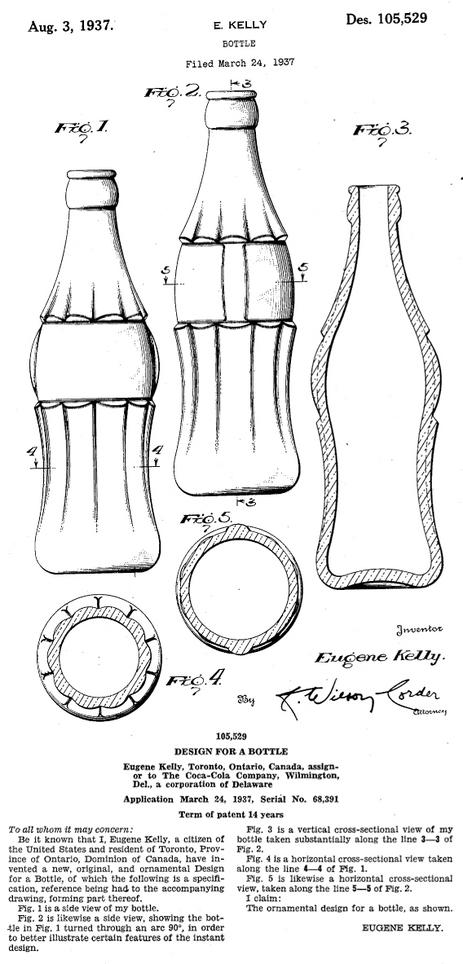
It also counts in the contour bottle, for 100 years still the undisputed symbol of the Coca-Cola brand. The story goes that the first bottle was inspired by the curves of actress Mae West who wore tight-fitting dresses known as hobble skirts. And this softness helped make it the most familiar design in the history of consumer goods, according to Stephen Bayley (a London-based expert on contemporary design).
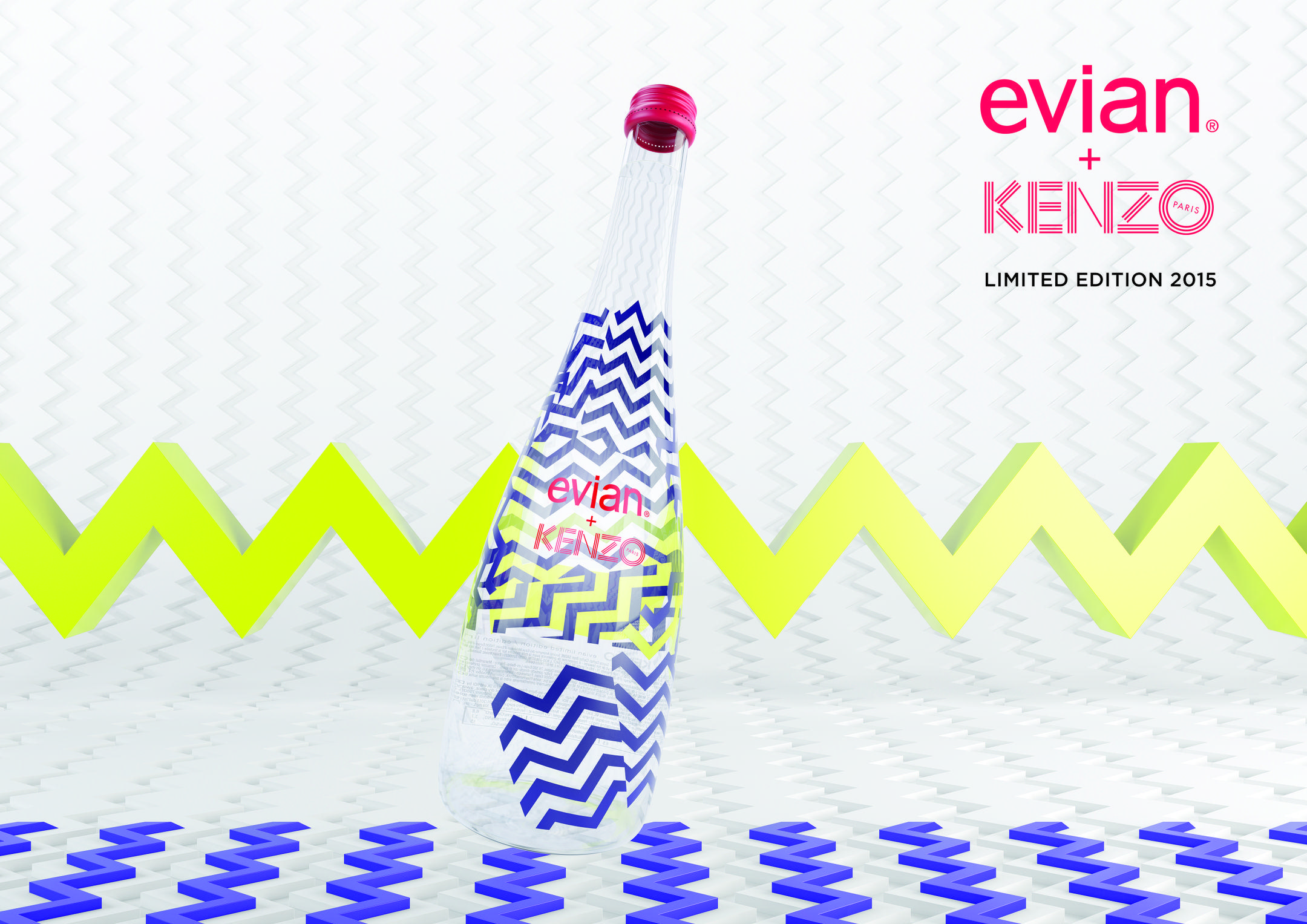
It also counts for Evian, which for thirteen years has entrusted the packaging of its bottles to designers such as Diane Von Fürstenberg, Jean-Paul Gaultier and Kenzo.
The shape creates an added value that allows Evian to sell a bottle of Kenzo’s 2015 limited edition for “only” $250 on e-bay.
Is the water it contains any different from the water in Evian’s normal €1 plastic bottles? No, but the shape makes all the difference.
It is the most obvious feature of packaging, the one that obviously determines the propensity to buy the most. Every parent knows how colours immediately attract children to supermarket shelves.
Each colour through its hue, brightness and saturation forms synaesthesia with sounds, scents and shapes.
Each colour is extremely evocative of all the other senses and of countless meanings.
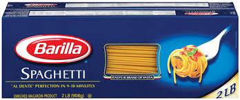
The ‘abyss’ blue has been instrumental in the success of Barilla pasta.
Reliable, deep, almost maternal, in perfect harmony with the yellow of pasta, it has ennobled a poor product like pasta, previously distributed in paper bags, since the 1950s.
Even today, Barilla blue immediately stands out among the countless colours of the large-scale retail trade.
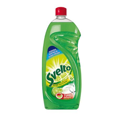
The packaging of the svelto detergent is then a unique case, capable of determining the market shift in the 1970s from powder to liquid detergents.
The green of the packaging immediately evoked the degreasing power of lemon, the sound of passing hands over the clean dish, the naturalness, all combined with the oblique design that suggested tilting the bottle to use the detergent immediately.
Today’s consumers are paying more and more attention to environmentally friendly packaging, to cartons and papers produced in controlled, FSC-certified forests. To paper rather than plastic fillers, to paper adhesive tapes with water-based glues. This is why we increasingly handle packaging through traceable European supply chains and favour natural materials.
Sources
http://www.rajapacktoday.co.uk/
Artful advertising Giovanna Bandiera
Manual of Advertising Techniques Marco Lombardi _ Mauro Ferraresi
http://storianellabottiglia.blogspot.fr/2012/12/brevetto-bottiglia-contour-coca-cola.html
For images
http://www.acquedilusso.it/xmas.php
http://gaiamarfurt.blogspot.fr/2011/12/pattern-di-natale.html