Packing tape with print! – understand the process behind…
11min read
01/05/2025


Our online tool RAJAprint, where you can create your own tape and personalise it with logos, quotes and prints of your choice – is a popular tool among our customers. But behind the process lies a lot of technology and know-how that is important to know in order to achieve a perfect result…
…we’d like to help you with that knowledge – in this post you’ll get a tour around the technology and printing process behind a ‘Tape-with-print’.
If along the way you still feel confused, you can always contact our specialists:
44 58 77 00 | info@rajapack.dk
…or via the chat on our website rajapack.dk.
Flexographic printing is a letterpress printing method. Which (very briefly) means that the printing method is similar to potato printing. The areas to be printed are highlighted on the print form, in our case the cliché, and are the ones printed on the adhesive tape/tape. The cliché is a bit like a stamp, a direct printing process where the printing is done directly on the printing material – therefore the designs have to be created in reverse when the cliché is made.
As a customer you do not have to create your logo in reverse, this is done during the cliché production. The cliché is made of an elastic rubber or nylon plate (also called nyloprint) which is applied to the printing cylinder.
A separate cliché is produced from the print for each colour in your design, so the more colours you want to print, the more “stamps (Clichés)” are required. The cliché is a one-off production and a cost to be added to the purchase price, however only for your first order or changes.
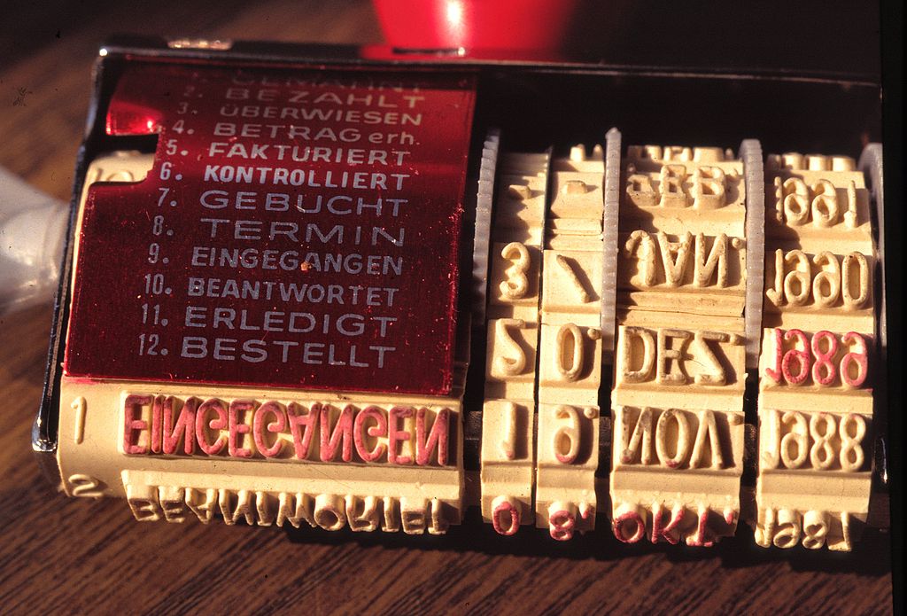
Two important terms to know when it comes to tape printing are positive and negative print. These relate to the design of the layout and the associated implementation in a “stamp” i.e. your Cliché. Let’s say your print is a circle, with positive print this circle is raised on the stamp and the rest is lowered – i.e. the circular shape touches the substrate during printing and uses your ink. (the image of the reservation stamp is a positive example).
With negative printing, the circle is lowered or cut out and thereby removed from the stamp, leaving the rest of the area around it raised and therefore touching the surface during printing. Thus it is the background around the circle that is printed in your colour and the circle itself is omitted. Depending on whether you choose a transparent, brown or white tape, the circle will have the colour of the tape in this case.
In the following you can see the difference:
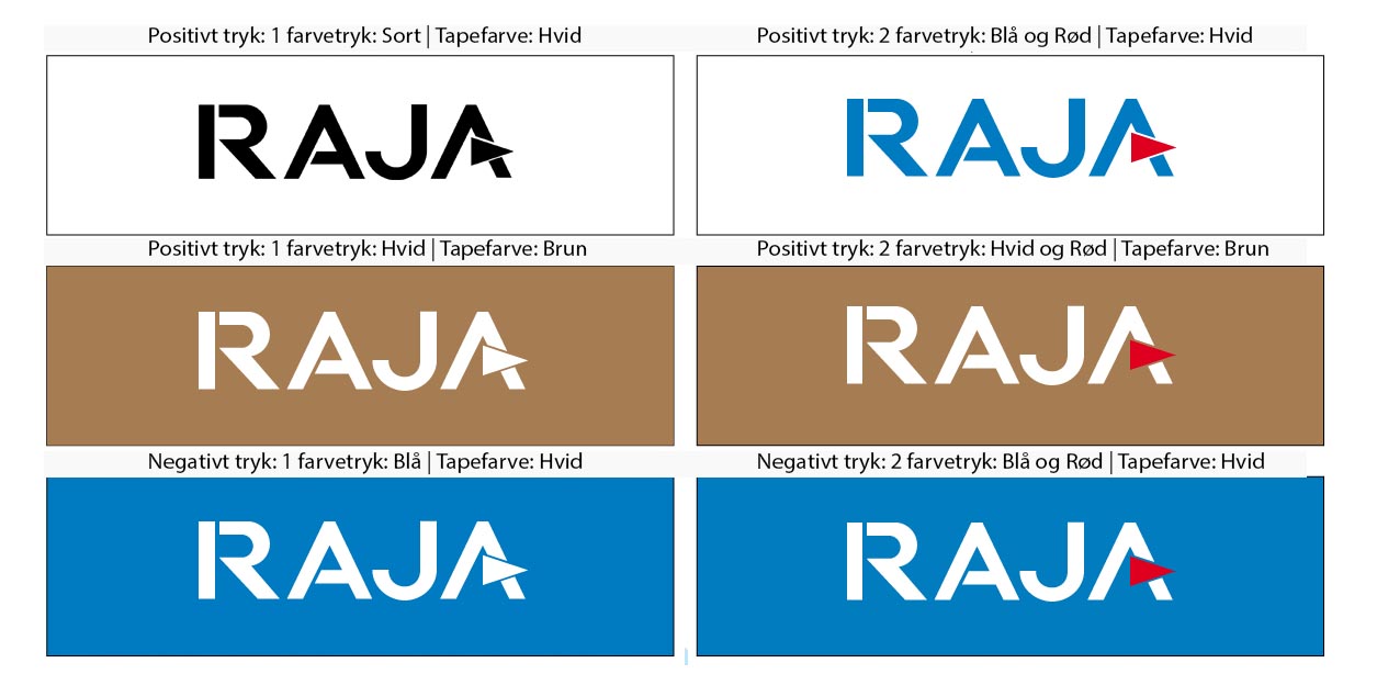
With positive printing, the original tape colour forms the background and the print motif forms the foreground.
When printing negative, the white, brown or transparent colour of the tape appears. The blue background colour was printed and the letters were left out.
As a little mnemonic for negative printing: if you don’t want your tape to have the typical tape colour (brown, transparent, white), print the desired colour as background.
Here you can see an example of a tape we designed for Copenhagen Home Design, the tape is originally white and made in Negative Print, where the black color is applied to the white tape. This also means that the only colour used is black.
When making your own printed tape, it is important to understand colour theory. We will try to give you a simplified understanding here as color theory is a science in itself. The human eye can (based on calculations and estimates) distinguish about 20 million colors. Using this huge range of colors is a big challenge.
The colours that appear in your digital images, such as on TVs, smartphones and computer screens, are created by light. The three basic colours red, green and blue (hence the term “RGB colour”) are played as small, separate coloured dots with different brightness levels. These are then “mixed” in the eye, resulting in a corresponding coloured area. If you look at your screen very closely, you may be able to see the different coloured dots – if you magnify it, it looks like the picture below.
Adding the colours at an appropriate brightness creates an impression of white to the eye. Without light, i.e. without luminous dots of colour, the impression of black or dark results. The image on your screen becomes sharper the more small “dots of colour” it can display. In your private life you may have noticed this when you switched from a tube TV to an HD device.
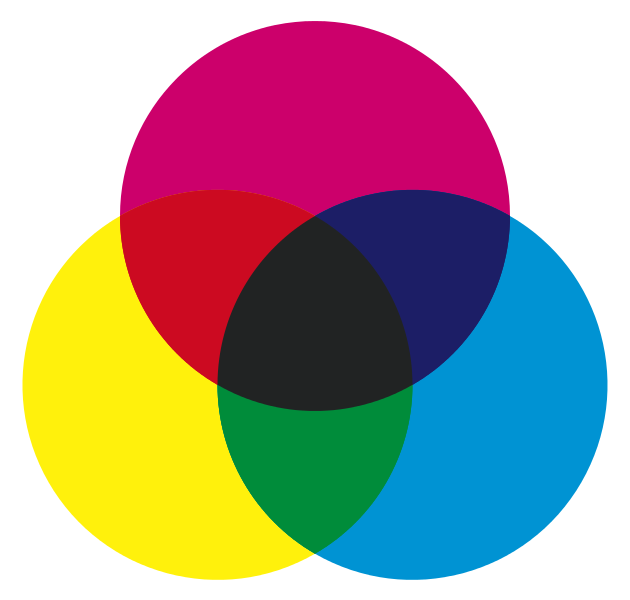
While your monitor basically “does nothing” (no light) when it displays black, your printer has to work hard. Here, the perception of black arises from the superposition of all three colour components cyan (bluish), magenta (reddish) and yellow. White, on the other hand, cannot be displayed or printed in this way, but is usually the base colour of the printed paper.
However, black (as can be seen in the picture) is not completely dark or “deep black”, which is why most printers have an additional black cartridge, also known as a “key-color”. This enables the printing of deep blacks and gives colour images the necessary depth that cannot be created by simply mixing the other colours. In the picture you can see the different colour applications separated according to the original colours.
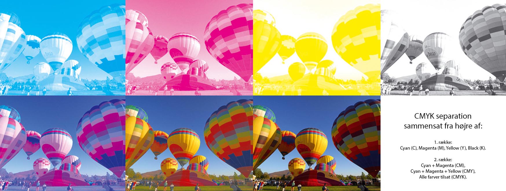
Not only your office printer, but also professional printers usually work with CMYK colours and therefore also require printing data with a CMYK colour profile.
If you look at an image under a magnifying glass, a printed image is a huge collection of small dots of colour in the colours C, M, Y and K in different sizes, which are mixed by your eye (just like on the screen) and perceived as a whole by the eye.
As already mentioned, flexographic printing is used when printing your tape. The basic colours are not fixed here, but you decide “in which paint bucket” the stamp/cliché should be dipped to make it look like your print/logo. An almost unlimited range of colours is available and you usually choose from the Pantone colour system, which currently contains almost 1,800 colours.
The purpose of these colour systems is to create an international uniform and binding standard. Thus, colour determination is not based on a sense of proportion and you can be sure that the green you ordered will also be the printed green you receive. You can find an overview of the colour system on these pages and also convert your RGB or CMYK colours to Pantone colours:
Pantone Colors:
http://rgb.to/pantone/coated/page/1
https://www.pantone.com/color-finder
In the case of a 2 colour print, 2 printing plates are produced. In 2 steps, these are each dipped into their can of ink, of your choice, and then pressed onto your tape to form your print.
At RAJA we go through all the stages with you, so you can be sure that what you have designed is what you will get. You will always receive the finished Cliché for approval before it is produced. Get started now and design your own printed tape right here.
What do vector and pixel graphics have to do with tape? In the Rajaprint tool, you can easily incorporate graphics, such as your logo, into your own design. To achieve a perfect print result, it’s important to distinguish between image file types and other graphics file formats. We therefore explain the difference between pixel graphics (raster graphics) and vector graphics in a palatable way below:
The pixel term is most familiar to us in everyday digital photography. For example, the camera on the current iPhone (11) has 12 megapixels. This means that the camera captures about 12 million different pixels (and their colour) in one photo. These are then displayed in an area 3264 pixels wide and 2448 pixels high, resulting in the image. Each of these 12 million pixels is defined by its position in the pixel area and colour.
Below is an image of one of our factories – this was shot by a professional photographer at 5760 x 3840 pixels. It is therefore very detailed and at a fine resolution and the file is correspondingly large. For display on our blog it was reduced to 800 x 533 pixels.

You can recognise pixel graphics very quickly by the file format: the most common are .bmp, .gif, .jpg / .jpeg, .png and .tif. Below is a link to a list of file formats and a guide.
https://digitypes.dk/billedformater-guide/
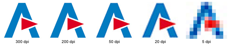
The size of the resolution is extremely important for the print quality. The unit DPI (dots per inch) is crucial for this. Graphics can be enlarged and reduced as desired on the screen, but if an image is to be printed, it has a real, fixed size, for example 5 x 5 cm. The dots per inch (DPI) relates this real size to the available pixel data in the image file.
As an example, for printed products (e.g. flyers) the 300 dpi requirement generally applies so that the image result gives a sharp, high-quality impression when viewed. For a printed image that is 5 x 5 cm, the following minimum pixel size is achieved:
If the image file is to be printed at a size of 5 x 5 cm, it must have a resolution of 591 x 591 pixels. In the following image you can see the result at “A” in the Rajapack logo when a graphic contains too little pixel information for a certain size.
Vector graphics have a crucial advantage over pixel graphics: they are 100% scalable and therefore independent of the number of pixels.
“Unlike raster graphics, vector graphics are not based on a pixel grid, where a colour value is assigned to each pixel, but are defined in terms of lines and polygons, which can be expressed mathematically, using vectors and points. For example. a circle can be completely described in a vector graphic using the position of the centre point, radius, line width and colour; only these parameters are stored. Compared to raster graphics, vector graphics usually use considerably less space. One of the main contradictions and advantages of vector graphics is that the generated can be scaled almost without limit without loss of information. “
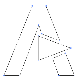
In vector graphics, the RAJA “A” does not consist of a specific number of blue and red points, but is generated only through the vertices and their position relative to each other. Since these proportions always remain the same, the graphics can be enlarged/zoomed without creating the angular “staircase effect” as in pixel graphics.

It is possible to scale a graphic, for example a logo, to any size, whether it is to be printed on a business card, poster or jumbo jet. As a logo usually needs to be placed in all sorts of places, logos are usually also created as vector graphics and then, if necessary, saved as pixel graphics. One disadvantage is that they can usually only be created and edited using a professional graphics program.
You can recognise a vector graphic very quickly by the file formats:
.eps, .svg, .cdr (from Corel Draw software), .ai (from Adobe Illustrator software), possibly also .pdf files.
Vector graphics are ideal for creating ‘printed tape’. If you have your logo/graphic in vector format, this is what you will need to design your tape with. If an advertising agency has created your logo, you can certainly ask them for a file in vector format, just as you want it.
Of course, if you have any questions, feel free to contact our experts. They will advise you on the creation of your tape, explain the process in detail and help you with your questions.
They can be contacted here:
44 58 77 00 | info@rajapack.dk
…or via the chat on our website rajapack.dk.